
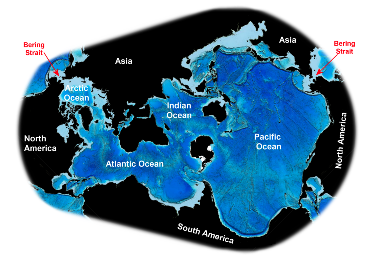
The Blue Marble
We call our regular Apollo based commentary “The Weather report”. The analogies that we can make with the multiple elements of Value, Momentum and Uncertainty impacting markets in a continuous way chimes nicely with the idea of Currents, Tides and Winds, all impacting the navigation of the high seas. Whatever the nature of the vessel concerned or the skills, experience and capabilities of the crew, the Maritime Weather Report is an essential part of the information system that is required and so the Market Weather Report is designed to perform a similar, essential function.
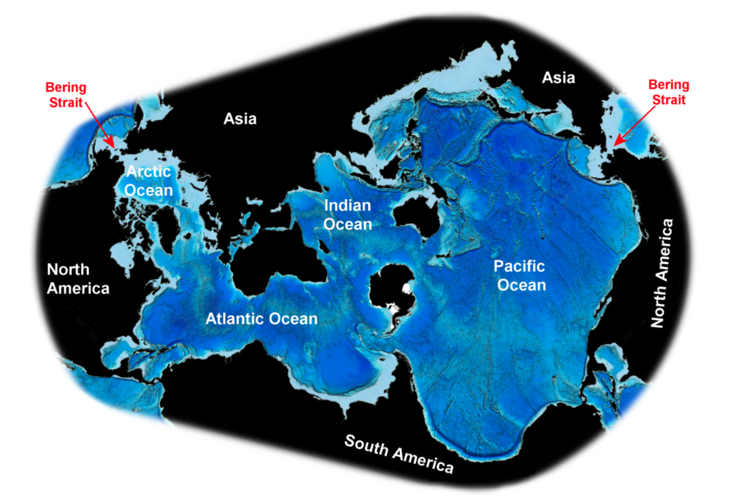
When, in 1972, Apollo 17 published the now famous picture of the Earth as a fragile “Blue Marble” in the emptiness of the solar system, it was the first time that the view of the world from the perspective of the South Pole had been seen in a near full earth view, with Antarctica “at the top” of the picture. The original photo was subsequently “inverted’ to look more like the “normal” orientation of most maps, but what still stood out was how blue it looked. Given that over 71% of the earth’s surface is water, this was not surprising but in response to this and in order to understand how those Oceans connect, a map – the Spilhaus World Ocean map – a variation of which is shown above – was produced by the eponymous author in 1979.
Given the narrative style of this monthly Weather report, the opportunity to show an Oceanic map is always going to be a temptation. (When I referenced the natural Kelvin waves last month, the idea that they would flow from the East and travel up the western side of Latin America and up the North-west coast of the US makes far more sense when you view the Oceanic coastlines from this projection, for example.) However, there is a wider benefit in showing this projection of the world. Arguably this is THE Geopolitical and financial market map of the world that tells the story best. Of course, the countries on the periphery are highly distorted in terms of land mass etc. but that it not the point of this image. To understand the economic and financial history of the world – the voyages of Discovery and the Age of Sail that began in the 15th century, the context of Vespucci’s “New World” of the 16th century, the developments of coastal trade (including the slave trade) flows of the 17th -19th century , the emergence of the British Empire and the establishment of the USA – we need to see how the connective tissue of this whole history – the blue of the marble – flows.
From this we can better understand the importance of the US railway boom and the laying of the first transatlantic cable in the late 19th century to the evolution of modern finance and the globalisation of the 19th -21st centuries. How the development of the Suez and (later) the Panama canals opened up the “Old World” of Europe to the wider reaches of Asia and the importance of the Spanish American war at the end of the 19th century.
Enough of the history lesson: The first and most obvious point we see from this map is the degree of coastline connectedness that it represents. The continuity from Newfoundland to Alaska (in either direction) – and the effective island chains that one sees just adjacent to this – Taiwan, Japan, the Philippines, Indonesia, the Hawaiian Islands, the East Coast of Australia, through to the Caribbean and Greenland – reflects some very clear geopolitical and economic trading and supply chain realities that might not be so obvious when looked at on a traditional projection but make absolute sense here.
But it is when that line from Asia then connects (via the Bering Strait) back to the Pacific North-West and along the North-west passage and completes the full coastal boundary to the “connected seas’ and thus the connected countries of the planet that the projection falls into full context. Without the choke points of the Red Sea, the Suez Canal and the Strait of Hormuz Europe is a VERY long way from Asia, whilst the importance of the Straits of Taiwan, Magellan, Gibraltar, Bering and Malacca, and the Panama Canal- all can be recognised from this projection and put in the context of global trade and geopolitics.
Watch the Clock
Overlay a clockface on the map (centred on Antarctica) and it is clear that the Mag-7 stocks (and all AI-related companies) are all located between “2 and 4 o’clock” (Tesla HQ’s “move” to Texas notwithstanding) and about 45% of the S&P by market cap is located along this segment, with most of its trade flows operating between “12 and 3 o’clock globally. After more than a century of financial market trade primarily focused on the businesses that operated in an “8 to 10 o’clock” range across the Atlantic, this geographic shift seems permanent and whilst the Monroe doctrine of the 19th Century might have been a domain focus of essentially “5 o’clock to 9 o’clock” on this map, the “Donroe” doctrine of 2026 looks far more akin to a “2 o’clock to 11 o’clock” strategy with a sharp political focus upon what happens in-between.
Meanwhile, financial flows appear to follow suit. Flows increasingly seem to go around Europe – not through it. Asian trade is directly to the West Coast of the North America and Middle Eastern finance is flowing to -and through -Asia to the US but not, seemingly, through Europe. To be clear, none of this is meant to be predictive. It’s just something I find interesting. Ultimately, it is an example of looking at familiar things differently and perhaps then thinking about them differently too.
Summer’s end
August has come and gone and with it the supposedly “quiet” summer period for the markets. Now, as we move into September, we enter what has traditionally been one of the weakest seasonal periods for market returns, with both corporate and retail activity dropping lower and US mutual fund purchases typically being at their calendar lows in September. Will history prove to be a good guide for the month ahead? As the only month to have provided a negative return for the S&P500 more often that a positive one (since 1928) the prediction markets would certainly have you believe it will, but context is everything.
The reality, of course, was that August – and the summer in general – was anything but quiet. The market rebound from the March lows had provided the base for a major momentum run into the start of Q3 – much of which appeared to be driven by leverage. This was compounded by what appeared to be an exceptional Q2 earnings season, with the overwhelming majority of US stocks beating on both earnings and revenues. Yet the emergence of interest rate concerns in the US, increasing question marks arising with relation to AI related Cap-Ex and after the dramatic collapse of the Situational Awareness fund in late July, there appears to have been something of a reality check. Post the July options expiry the US equity market has (constructively) cleaned up much of the distortive leveraged positioning that had built up over the previous 3 months. The deleveraging that occurred over the course of July and into August has seen volatility (both index and single stock) drop sharply (the Vix closed at 14.4 last Friday) and this has left downside protection for the market very cheap.
Vigilante time
At the macro level, the story is all about the bond markets. Against a backdrop where global conflicts appear unresolved, energy prices remain high and inflationary pressures are persisting, the long end has continued to decline. Broader pressures in credit markets are also building (not least those relating to the potential demand for AI data centre related financing) and focus is now back on the potential for a change in policy stance from the US Federal Reserve. After the Fed left the Fed Funds rate unchanged at the end of July, fears of higher rates that had been building up over the month eased to a degree, but it nevertheless triggered the sell off at the long end. Comments emerging from the recent Jackson Hole Event have led markets to sense that the new Fed Chair is shifting to an increasingly hawkish stance and by the next FOMC decision on 16th September the market will be looking to confirm that.
Review of Performance – beneath the waves
In taking our normal look at some of the recent performances of the main market indices through the lens of the Apollo strategy models (price performances are to index close values from 31 August 2026) we continue to build upon our thoughts over how markets have handled things over the last few months; focusing in on the 3m% and the YTD numbers.
For context, the 6-month returns in Table 1 take us back to the end of February – the outset of the outbreak in hostilities in the middle East whilst the 3-month number taking us back to the end of May. The one-month numbers give sight to how well markets have recovered from the July “reset”.
Table 1: Performance Report (price returns %)
| Index/Strategy | 1m (%) | 3m (%) | 6m (%) | YTD (%) | 1Y (%) |
| S&P 500 Index | 3.8 | 2.0 | 12.1 | 12.6 | 18.6 |
| S&P500 (Equal weight) | 0.9 | 5.1 | 7.2 | 13.5 | 17.2 |
| NASDAQ 100 Index | 6.0 | -2.6 | 17.8 | 16.6 | 24.2 |
| S&P1200 Index (Global Developed Markets) | 4.2 | 2.4 | 10.2 | 14.0 | 21.3 |
| Smart Alpha US Large Cap Multi-Factor Strategy | 3.7 | 4.1 | 8.7 | 14.4 | 22.4 |
| Smart Alpha Global Large Cap Multi-Factor Strategy | 6.2 | 9.0 | 15.9 | 23.4 | 30.1 |
| Smart Alpha US Large Cap Value Strategy | 0.7 | 5.0 | 7.4 | 14.8 | 13.2 |
| Smart Alpha US Large Cap Growth Strategy | 3.2 | 2.6 | 6.9 | 15.9 | 28.4 |
| Smart Alpha US Mid/Large Cap Multi Factor | 4.4 | 7.3 | 8.5 | 19.1 | 25.2 |
| Smart Alpha US Mid/Large Cap Value Strategy | 0.4 | 3.9 | 3.3 | 10.3 | 15.1 |
The one-month story continues to be dominated by the narrative around AI. As the Nasdaq 100 return shows, the shift in risk appetite for Tech and AI related investment has been extremely volatile since the start of the summer and so the post Fed July 29th meeting rally was able to return the index back to close to where it started in June (the still negative 3m% return). Note that both the market cap weighted S&P500 performed strongly in August (as did the S&P1200) as the Mag 7 recovered but the equal weight was up less than 1%.
After eight months, the YTD performances are converging on the relative 6-month performances for the simple reason that the reality of the March sell off (post the outbreak of hostilities in the Middle East) saw most – if not all – of the early performances of the year being reset to zero. Stronger performances outside of the US – in Japan and Korea for example -reflect a bounce back from yen related and AI related profit taking in late July/early August.
Alongside the benchmarks we can see the selection of Smart Alpha – that we run (and publish – see https://www.libra-is.com/strategies ) reflected here. On both the one-month and the YTD basis, there remains clear water between the Smart Alpha Multi-Factor strategies and their respective benchmarks with the Global Multi-Factor in particular, showing a nearly 10% outperformance over the S&P 1200 benchmark on a YTD basis ((+23.4%) vs (+14.0%)). Meanwhile, the positive impact from a rotation into mid-caps is clear from the performance of the US Mid/large Cap multi strategy (+4.4%) which is now (+19.1%) YTD and a significant outperformer over all other US related strategies on the system.
From a style perspective the Growth/Value trade-off can be seen in the data for the various US Value and Growth strategies that we run and where, having caught up with Growth over recent months Value has taken a back seat in August as growth rebounded. We can generate these distinct single-style strategies by virtue of the fact that we categorise all the stocks under coverage by “style factor” based upon our own, fundamentally derived classifications (Value, Growth, Quality, Junk etc.) using the Apollo model for expected returns. This allows us to dive a little further into the drivers of returns.
Risk (and returns) by Factor
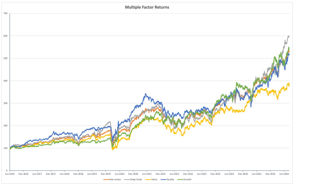
In terms of the factor drivers that we can see within a strategy (Table 2) the differentiated drivers of the Global Multi–factor portfolio from the sub-portfolios YTD has seen a strong Q2 from Deep Value continuing into the summer (+32% YTD), and an even stronger (double digit) start to Q3 from both Quality (+11% in July, +3% in August, and +27%YTD) and Growth (+12% in July, +3% in August, and +20%YTD) as June declines reversed. Value did some catching up in July (+6%) but faltered in August (+0.5%) on a YTD basis (+9.3%), still lags heavily in relative terms. As always, these Factor returns reflect our bespoke factor categories and stock selections – combined with the two-month rebalance that we undertake. Our last Rebalance was in mid-June and the performances of this latest sprint are also shown in the table.
Table 2: Global Factors

Chart 1 shows the longer-term trends of factor returns and illustrates this point further. Deep value (grey line) stands out at the top of the chart with Quality – the dominant (blue line) from 2016 onwards remaining aligned with both the total portfolio (orange) and clearly ahead of value (yellow) over the total period. Growth is a clear, compounding winner over longer horizons and as noted above, one of the dominating factors of late. Meanwhile, the relative under-performance of Value remains only too visible on the chart, perhaps suggesting that value stocks are performing more of a risk management than a total return role in portfolios at present.
Chart 1: Compounding returns
Weather Forecast – Seasonal conditions
What the YTD data tells us is that equity investors across the board are sitting on double digit returns comfortably before the end of Q3. The scramble to post a credible return by year end (or more likely by Thanksgiving) that we have witnessed in the past is absent this year, but the wish to retain it will remain. With volatility trading at such low levels, it would be unsurprising to see some investor groups looking to lock in those gains early, but the relative returns game still matters. If any sign of a further momentum rally takes hold post the FOMC meeting – or indeed if there is news flow and activity around AI related issuance in the form of credit products or IPOs (Anthropic or Open AI in particular) – then double-digit returns will become a floor requirement for funds and we might see leverage and momentum trading return to markets into quarter end.
Chart 2: The S&P bellwether
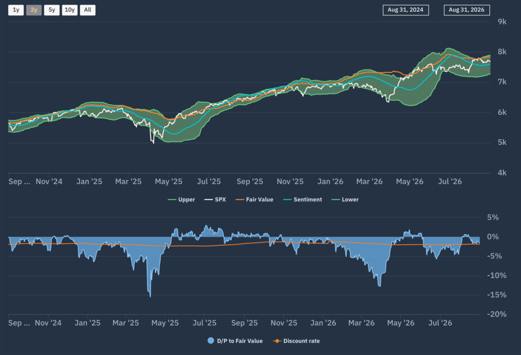
If we take a look at the Apollo market chart for the (market Cap weighted) S&P500 shown in chart 2, we can see how the index level rallied from a relative low at the end of July to test the top of the FV range (and the FV level itself) by mid-August, before settling into the upper (positively trending) FV range whilst the discount rate the market is “applying” to FV appears to be normal – suggesting market concerns over interest rate risks have at least steadied for now.
Moving down a level, we can look at whether there are any sector level dynamics now emerging that can be used to read across to other markets and Chart 3 is the Apollo chart that we use to do so. This is the Apollo beta heatmap for the S&P500 that shows the relative sector rankings in terms of rolling 1-month returns across the main US S&P500 market sectors, ranked by relative market beta from high beta (cyclical sectors) down to low Beta (defensive sectors).
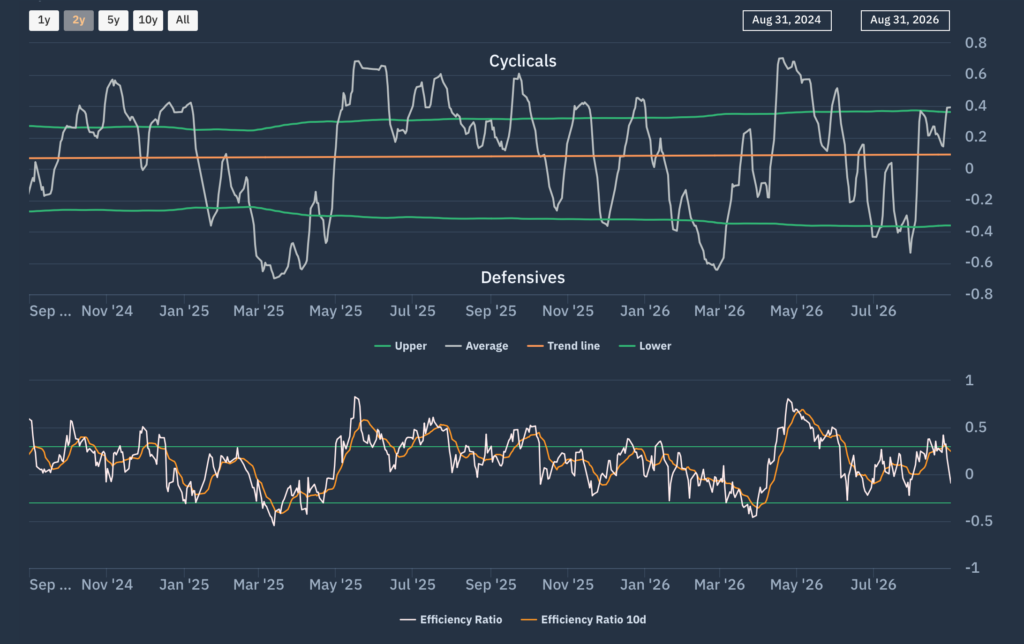
We can see how energy remains a standout performer over the last month but starting mid- August, the Tech sector and consumer discretionary sectors have picked up the lead. Our “Macro indicator” shown here on our Net beta chart (Chart 4) captures this shift back towards higher beta (greater risk appetite) and confirms the rotation that we had anticipated back towards Tech in last month’s report has indeed happened.
Chart 3: Apollo S&P500 Sector Heatmap
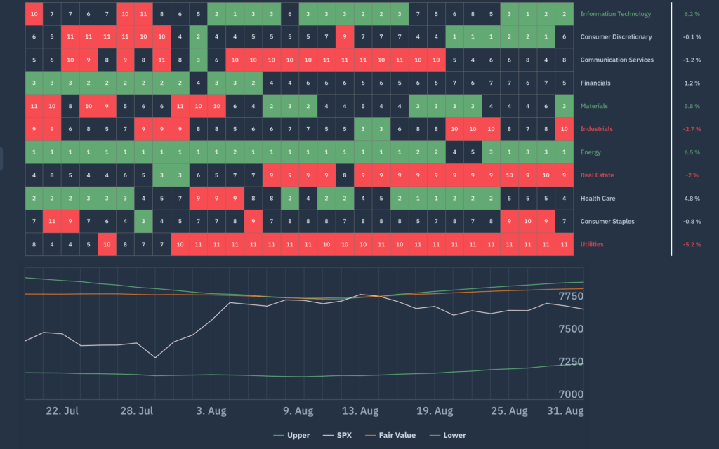
Chart 4: Apollo S&P500 Net Beta Chart
Forecasts and conclusions
I started this report with a map projection that might not have been familiar to some, but that was designed to highlight the interdependency of global markets and economies -both past and present. The “connective tissue” of the planet – the blue seas of the “blue marble” are often treated as discrete entities – the Indian Ocean, the North Atlantic, the Southern Pacific, the Sea of Japan – but their connectedness becomes obvious when looked at from this perspective. Regional divisioning – for reasons of time zone, language or simple convenience – is a hallmark of both geography and financial markets but in reality, is only that – a convenience.
Investing by region – either by default or by constraint – no longer makes sense beyond that. The recent collapse in leveraged retail funds in Korea was because of the initially highly positive impact that a global memory supply shortage was having on Semiconductor stocks SK Hynix and Samsung Electronics – driven by parallel demand for GPUs constraining chip manufacturing capacity. However, the collapse in share prices was fuelled by both local and global leverage flows -in particular leveraged semiconductor ETFs- reversing as a degree of AI scepticism prompted margin calls and forced selling.
This was a direct consequence of developments across the “hyperscalers” in the US as their free cash flow forecasts turned negative in the light of exploding Cap-Ex commitments, broader market liquidity questions in the aftermath of SpaceX’s IPO, general concerns over rising energy prices, the summer weakness in the yen and the outlook for rising (US) interest rates. The impact of these macro concerns do not remain local – they become global factors almost immediately, thanks to the disintermediation of global capital around and across our map.
The frustration for the traditional regional approach to investing is that such external risks cannot be mitigated completely but that the counterbalancing investment opportunity might not be available (a lack of Energy companies to invest in to take advantage of current prices for example). Europe, with its lack of Technology related listings, has a wide range of European focused investment indices, portfolios and funds that are structurally suffering from a lack of exposure to the (global) growth drivers seen to be benefitting the listed companies of the US and Asia in over the last few years.
By contrast, whilst global investment funds cannot hide from the impact of macro events, elsewhere, they can take advantage of being able to access global growth drivers anywhere they are listed. So, for those who worry that, in buying a global fund, you run the risk of “not being diversified away from US exposure” because of the high weighting of US stocks… don’t worry. Instead ask whether an existing exposure to US-only stocks is giving you too much of an exposure away from the global companies currently benefitting from global demand. With the YTD performance of our Global Multifactor Smart Alpha portfolio being almost double that of the US benchmark S&P500 index, it is certainly a question worth asking.